Cold Email Benchmarks: What We Measured Across 54,478 B2B Prospects
First-party reply-rate data across three B2B software programs, the limits of universal benchmarks, and a model for forecasting qualified pipeline from your own funnel.
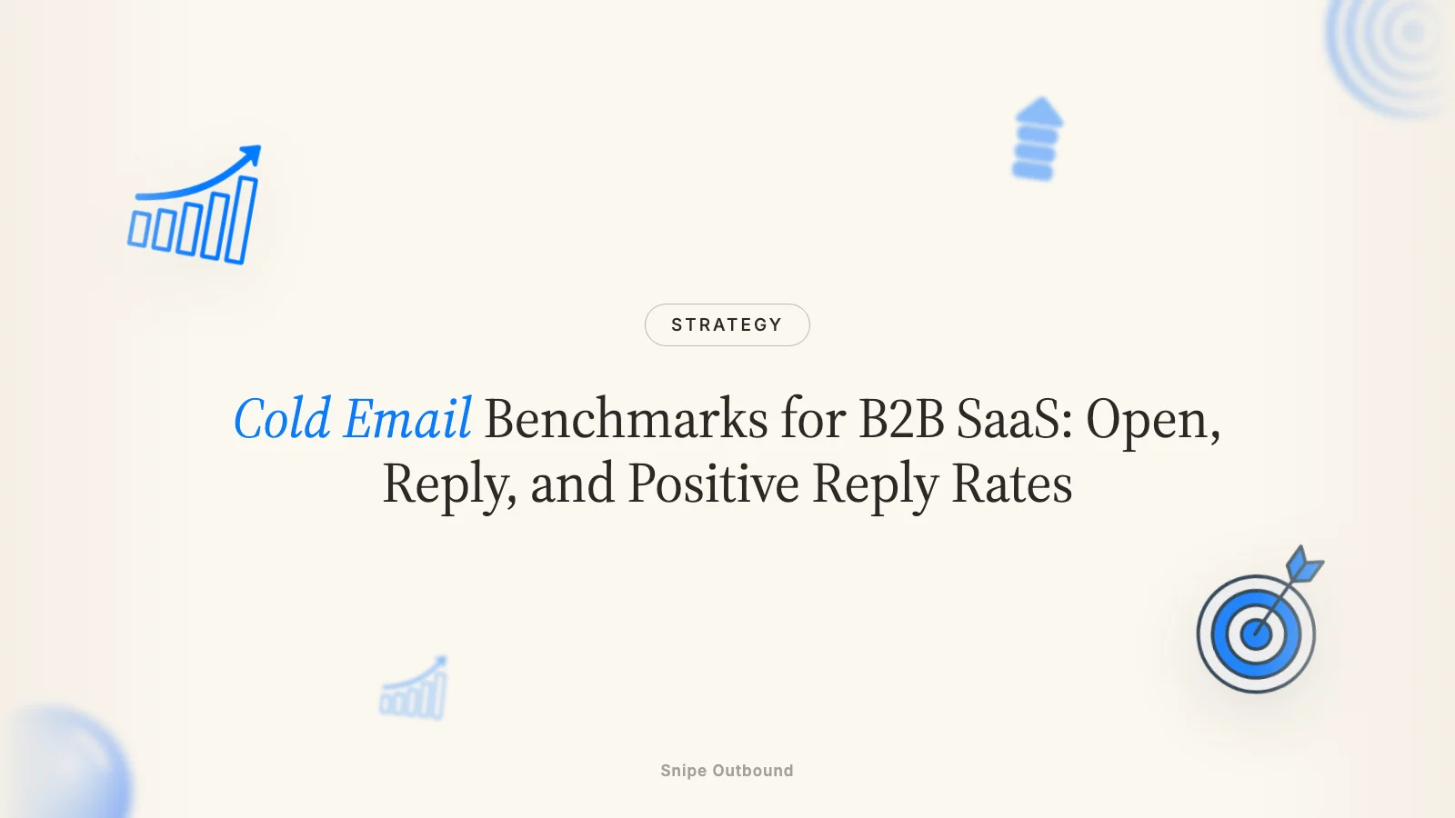
Across 54,478 contacted prospects in three operated B2B software workspaces, Google Workspace recipients replied at 3.10% versus 0.30% for Microsoft 365 recipients. The tenfold gap means a blended “industry average” can misdiagnose provider mix as a copy problem. Benchmark each funnel stage against your own segments instead.
The benchmark is a distribution, not one magic number
Cold email benchmark pages often compress different markets, inbox providers, list sources, definitions, and time periods into one “good reply rate.” That number looks decisive but hides the variables a B2B software team can actually act on.
Our own data shows why. The same broad operating category produced materially different reply rates after we split contacted prospects by recipient email provider. Enterprise teams should be especially careful: Microsoft 365 and secure email gateways make up more of many enterprise account lists, so a blended rate can fall even when the target accounts are correct.
What our first-party data actually measured
We aggregated recipient-level campaign exports from three separately operated B2B software workspaces and classified company domains by live MX records. The table covers only Google Workspace and Microsoft 365 recipients because those two groups had enough volume for a useful comparison.
| Recipient provider | Contacted prospects | Recorded replies | Reply rate |
|---|---|---|---|
| Google Workspace | 41,478 | 1,286 | 3.10% |
| Microsoft 365 | 13,000 | 39 | 0.30% |
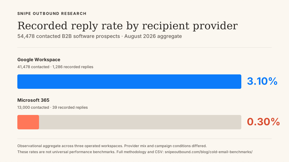
The pooled Google rate was about ten times the pooled Microsoft rate. That does not prove Google will outperform Microsoft by the same amount in every campaign. It proves provider mix is large enough to invalidate a universal reply-rate threshold unless the comparison controls for it.
Methodology and limits
- Unit: contacted prospect, defined as a record with at least one campaign send.
- Reply rate: recorded replies divided by contacted prospects, not delivered messages or opens.
- Scope: three B2B software workspaces exported in August 2026; customer identities are not published in this aggregate.
- Provider classification: company domains grouped from live MX records rather than an incomplete platform label.
- Limit: observational data, not a randomized test. Lists, offers, copy, geography, timing, and infrastructure differed.
- Not included: no universal open, positive-reply, meeting, or bounce benchmark is claimed where the underlying definitions were not consistent enough to support one.
You can download the aggregate benchmark as CSV. It contains no prospect-level or customer-identifying data.
Snipe Outbound. “Cold Email Reply Rate Benchmark by Recipient Email Provider (2026).” August 2026. Aggregate of 54,478 contacted prospects across three operated B2B software workspaces. Cite the sample, definitions, provider split, and observational limitation rather than treating the rates as universal benchmarks. Download the CSV.
Reuse this chart with attribution
You may republish the chart unchanged. Credit “Snipe Outbound, Cold Email Reply Rate Benchmark (2026)” and link readers to this page so they can inspect the methodology and data.
<a href="https://snipeoutbound.com/blog/cold-email-benchmarks/#methodology"><img src="https://snipeoutbound.com/assets/research/cold-email-reply-rate-by-provider-2026.png" alt="Recorded cold email reply rate by recipient provider in Snipe Outbound's 54,478-prospect observational aggregate" width="1200" height="675"></a>The measurement ladder that matters
- Contacted prospects establishes the denominator. Separate first touches from sequence sends.
- Human replies excludes out-of-office messages, bounces, and automated responses.
- Positive replies uses a written classification rule instead of treating every response as intent.
- Booked, held, and qualified meetings stay separate so no-shows and weak qualification cannot hide inside one number.
- Accepted pipeline is the sales team’s downstream confirmation that the opportunity belongs in the funnel.
Why open rate is not a dependable outcome benchmark
Open rate can be a diagnostic input, but it is not a verified human-attention metric. Two primary sources explain the limitation:
- Apple can download remote content before a person reads the message. Apple’s Mail privacy documentation says protected activity privately downloads remote content in the background when a message is received instead of when it is viewed.
- Google does not validate third-party open-rate reporting. Google’s email sender guidelines state that Google does not track open rates and cannot verify the accuracy of rates reported by third parties.
- Opens stop before business intent. An open cannot distinguish interest from curiosity, filtering behavior, or automated image loading. Replies, qualification, held meetings, and accepted pipeline are closer to the business outcome.
Use open rate only as a directional signal when the tracking method stays constant. A sudden within-domain change can justify a deliverability investigation, but it does not identify the cause by itself. For the sender-health side, use the cold email deliverability guide and provider-specific response data.
What replaced it as the north star
No single rate replaces it. Use a ladder: human reply rate, positive reply rate, booked rate, held rate, qualified-held rate, and accepted pipeline. Every transition gets its own denominator and written definition.
How to read your own numbers
Compare like with like before diagnosing a leak. Hold the market, recipient provider, sequence window, denominator, and classification rule constant. Then inspect the funnel from the first measurable break:
- Bounces or invalid addresses rising? Audit sourcing, verification, catch-all treatment, and suppression before changing copy. The list grader can structure that review.
- One inbox provider underperforming the same segment? Inspect authentication, infrastructure, reputation, volume, and gateway behavior before calling it a messaging failure.
- Human replies are low across providers? Recheck target selection, timing, offer relevance, and message. The cold email grader can pressure-test the copy after the list is controlled.
- Replies are mostly negative? Report negative-reply share separately. High total reply rate can still represent poor targeting or an unwanted angle.
- Positive replies fail to become held, qualified meetings? Audit response handling, scheduling friction, reminders, qualification rules, and sales handoff separately.
Read by segment, not by account
A blended campaign average hides provider, persona, industry, geography, company-size, and message differences. Break results out by those dimensions, but do not declare a winner from a tiny cell. Record the sample size beside every rate and compare the same time window. For enterprise account lists, keep Microsoft and secure-gateway prospects visible rather than deleting the accounts that make the market valuable.
Turning benchmarks into a pipeline forecast
Forecast from your own observed transitions, not from the pooled reply rate above. The model is:
Contacted prospects × human reply rate × positive share × booked share × held share × qualified share = qualified held meetings.
For a transparent hypothetical example, 10,000 contacted prospects × 2% human reply rate × 30% positive share × 40% booked share × 80% held share × 50% qualified share produces 9.6 qualified held meetings. Those percentages are example inputs, not Snipe benchmarks or a performance promise. Replace every input with a trailing cohort from your own CRM and calendar. Our guide to forecasting meetings from cold email shows the denominator choices.
When an in-house team is the better measurement owner
An in-house team can be the right choice when it has a defined market, enough capacity to manage infrastructure and replies, and direct access to qualification and pipeline outcomes. The decision is operational, not a benchmark threshold. Compare ownership, data access, governance, and learning speed using the agency-versus-SDR framework.
How we approach these benchmarks at Snipe Outbound
Where we spend effort maps to the measurement ladder: client-approved targeting, dedicated sending infrastructure, research and copy, reply handling, qualification, booking, and feedback from held meetings. We keep provider, segment, campaign, and CTA context available so a blended average does not become the diagnosis.
If you want a second set of eyes on your current numbers, book a call with us. We will separate the visible symptom from the likely operating constraint and say when the data is too thin to support a decision.